Two-Color Flower Applique: Buttons, Pendants, Earrings
Hand-built two-color flower applique for buttons, pendants, and earrings looks deliberate when the petal layer, contrasting center disc, and tiny accent dot are built in scale relationships. This guide covers petal cutter sizing, center disc proportions, and how to seat the parts without flattening the petals.

In brief
Key takeaways
- 1Set the base disc size first. Cut the petal layer at roughly 60 to 70 percent of the base width so the flower has room to breathe
- 2Place the contrasting center disc at roughly 30 to 40 percent of the petal width. That ratio anchors the eye without eating the petals
- 3Seat each layer with a silicone shaper, pressing only at the center. The petal edges should stay visibly lifted, not flattened in
- 4Match clay temperatures across all three layers in one session so the petal-to-base bond holds through cure
A two-color flower applique looks simple on paper. Cut a petal shape, drop a center disc on it, add a dot, done. In practice, the failure modes are everywhere: petals that get mashed flat, center discs that swallow the silhouette, accent dots that drift off center.
Better cutters rarely solve this. The real fix is a clearer set of scale relationships and a tighter build order. When the petal layer, center disc, and accent dot are sized in proportion to each other and to the base, the flower reads from across the room. When they are not, even careful work can read as stacked circles instead of controlled applique.
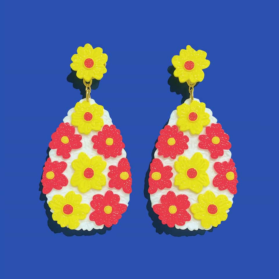
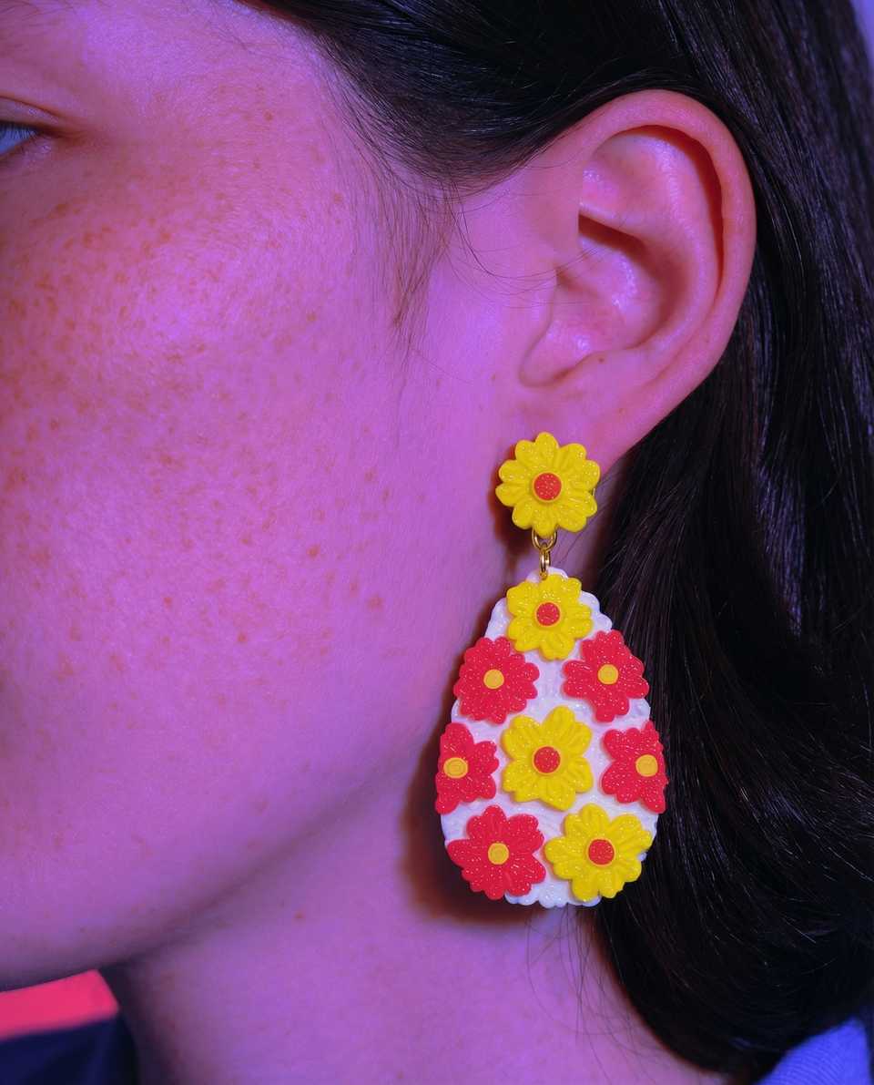
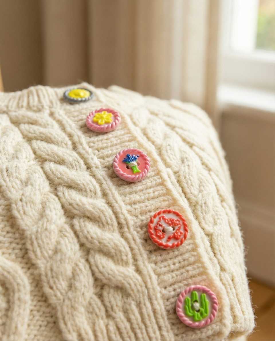
If you want a buildable reference, the two-color flower buttons and the clay flower earrings in the lookbook both use this applique approach.
Build The Base Disc First And Lock Its Size
The base disc is the canvas. Every other layer responds to this one, so choose its role before anything else gets cut.
Roll the base color into an even slab for the button, pendant, or earring topper you are testing, then cut the base disc with a clean round cutter. Try the petal layer against it before assembly. You want enough base color to frame the flower without making the flower look lost.
If the base will get a hardware mark (a button hole, a pendant top hole, a flat brooch back zone), pre-mark or pre-cut that hardware feature on the base before any flower layer goes on. Trying to drill or pierce through three layered colors after assembly is how center discs get displaced and accent dots get pushed off center.
For earrings, keep the base disc thin and light so the finished topper does not pull on the ear, cut or pierce the top hang hole before the flower layers go on, and build both pieces in the same session so the pair matches in size, color, and petal lift.
Match The Petal Cutter To The Base Rim
The visible base rim decides whether the flower feels intentional or accidental.
If the petal cutter is too small, the flower floats on a sea of base color and looks like a sticker. If it is too large, the petals run into the rim of the base disc and the silhouette fights the disc edge. Start with a petal cutter that leaves a clean ring of base color visible around it, then adjust from the test piece.
Mini flower clay cutters in a graduated set make this ratio practical, because you can choose the right cutter for each base size without freehand-cutting petals.
Roll the petal-color slab thinner than the base. A lighter petal layer keeps the lift subtle so the eye reads a flower, not a stack of clay pancakes. Cut all the petal layers for a batch in one session if you want them to behave consistently across pieces.
Center Disc Sizing And Color Choice
The center disc anchors the flower. Too small and it disappears. Too large and it crowds the petals down to thin slivers.
A center disc should feel clearly smaller than the petal layer while still giving the eye a clean focal point. The same mini cutter set includes small round shapes, so you can audition two or three center sizes against the same petal layer without a separate purchase.
Color choice carries weight here. The center disc usually wants to be the highest-contrast color in the build, because it is the smallest element. Pale petal on a cream base wants a darker disc. Dark petal on a cream base can take a saturated disc, like coral against ivory or cobalt against bone. Test two or three disc colors against the petals on a scrap before committing to a batch.
Seat Layers With A Silicone Shaper, Not A Fingertip
The single most common reason petals look flat is heavy fingertip pressure during assembly.
A fingertip presses across the entire petal width, which crushes the lift at the petal edges. A silicone shaper presses on a small contact area in the petal center only, which seats the layer without flattening the silhouette.
Silicone clay shapers are useful here because the soft tip seats the layer with even pressure and does not pick up clay residue the way a metal tool sometimes does.
Place the petal layer first, seat it with a shaper press at the center only, then place the center disc on top of that center contact zone. This stacking order keeps the petal lift visible at the edges while making sure the center is bonded.
Add One Tiny Accent Dot In The Center, Not A Ring
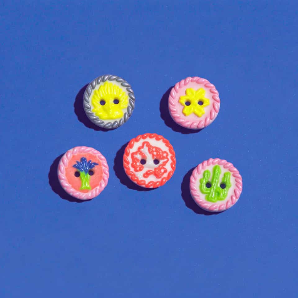
A small accent dot at the very center of the disc is what turns a generic two-color flower into a deliberate one.
Roll a tiny ball of accent color, often white, gold, or a saturated jewel tone. Place it in the geometric center of the center disc with a needle tool, not a fingertip. Press lightly until it bonds.
Resist the urge to add more dots. A ring of small dots around the center disc is a different design (often a daisy or anemone), and it changes the petal-to-center ratio because the dot ring effectively widens the center cluster. Keep the two-color flower clear with one dot.
Match Clay Temperatures Across All Three Layers
Cold center disc on a warm petal layer is how applique pieces lift at the edges after cure.
Condition all three colors in the same session. If you need to break the build into stages, rest the cut layers on a tile under a piece of parchment or plastic film so they stay similar in temperature and softness. A short pause is usually fine; a long pause where one layer cools or firms much more than the others is when bond failures start showing up.
For firmer lines such as Premo, Souffle, or Kato, a very thin film of liquid polymer clay brushed between the base, petal layer, and center disc gives a far more reliable bake-on bond than pressing raw layers together. Keep the amount tiny so the layers do not slide, and treat the temperature-matching and shaper-pressure steps as complementary checks rather than the only thing holding the flower together.
Use Applique Petals When You Need Control Over Shape And Color
A two-color flower can be made from a cane slice. The two approaches solve different problems.
A cane slice gives you a nearly flat motif with the colors locked into one slice. Applique gives you visible depth at the petal edge and full control over the center disc color and accent dot placement. If the lookbook reference shows clear shadow lines at the petal edges and a center that looks placed rather than printed, applique is the closer match. If the reference looks flush and graphic, a cane slice is closer.
A Flat Cure And A Light Topcoat
Two-color flower buttons and pendants usually cure cleanest flat on a ceramic tile, with no support unless the disc is unusually thick.
Follow your clay line package instructions and verify the real tray temperature with an oven thermometer. Firmer lines such as FIMO Professional and Premo hold crisp petal and disc edges and reward the full recommended bake time so the petal-to-base bond hardens fully. Softer lines stay easier to shape but can round off fine edges, so condition lightly and handle the cut layers gently.
Finish lightly. A matte or soft satin keeps the petal shadows visible. Heavy gloss can flatten the visual depth between layers and make the applique start looking like a printed pattern. Test any topcoat on a scrap before committing.
Test The Petal, Center Disc, And Accent Dot Sizes On Scrap Before You Assemble
Two-color flowers, hand-built blossom buttons, and applique floral pendants are easier when you audition the petal size, center disc, and accent dot before the first layer goes down.
Run a fingernail across the petal edge after cure: a faint catch means the lift survived the bake, and that small shadow line is what keeps the flower from flattening into a printed pattern.
From here, the surface applique and confetti inlay guide covers placement variations beyond flowers, and the buttons, holes, and flat baking guide walks through finishing decisions on functional pieces.
More guides in this path
Open these when the next decision is material choice, attachment, or finishing.

Polymer Clay Surface Effects: Cane, Inlay, Texture, or Print
You added inlay or a cane slice and the surface cracked or the pattern dragged because you chose the wrong technique for the shape. Match the effect to the result you need: repeating pattern (cane), precise placement (inlay), raised detail (applique), or loose texture (marbling/print). Then go to the right deeper guide.

Polymer Clay Surface Applique and Confetti Inlay Guide
If an inspiration piece looks like it was built from placed petals, dots, lips, stars, or tiny cut motifs, this is usually the technique family you need. Learn when to applique, when to press pieces flush, and how to keep flat builds crisp instead of lumpy.

Polymer Clay Buttons: Holes, Flat Baking, and Thickness
Small button sets fail when the holes are too close to the edge, the blanks bake unevenly, or the thickness drifts from one button to the next. This guide shows the repeatable build path that keeps polymer clay buttons more consistent and easier to test on garments.
Finished examples with related clay decisions
Each piece shows how a material, attachment, or surface choice changes the final form.