In brief
Key takeaways
- 1Mute any color by adding a tiny speck of its complement, the color across from it on the wheel. A little goes a long way
- 2Treat the sage and terracotta ratios as Premo starting points, not fixed formulas. Mix a small batch first and adjust
- 3Do a test bake with a small chip of the mix before committing a full project's worth of clay
- 4Keep a color journal: recipe, brand, and a baked sample chip stapled in. Future-you will thank current-you
Start with a small, labeled baked chip before you mix a production batch. Screen color and raw clay are only prompts; the cooled chip is the result you can compare.
If the package colors never quite match what you pictured, mix one small test chip, bake it by the package, label the cooled result, and adjust one measured part before scaling up.
Understanding Color Theory Basics
Use warm and cool direction, lightness, and complementary contrast to choose the next test. Treat these as visual prompts rather than fixed formulas for every clay line.
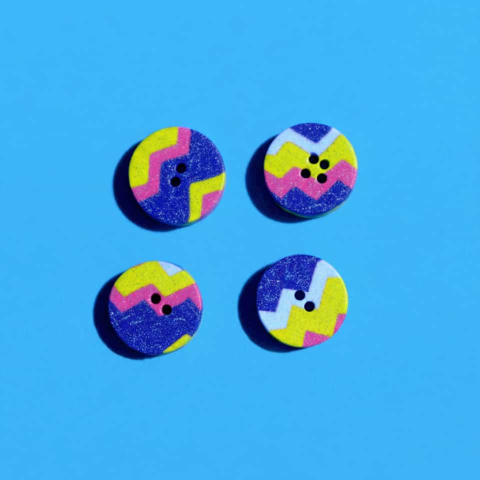
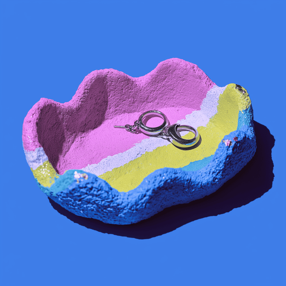
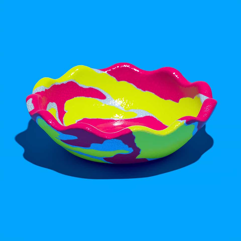
See this technique in finished pieces
Open related lookbook examples to see how the technique changes the cut, surface, or attachment point.
Build One Package-Directed Chip
- Choose one identifiable clay line for the first test.
- Condition each color by that clay maker's directions.
- Measure each addition by one consistent method, such as weight or equal-size pieces.
- Label the clay line, colors, ratio, and date.
- Bake at the time and temperature on the exact package.
- Let the chip cool before judging the color.
Try The Ratios As Starting Points
These mixes are studio prompts, not manufacturer formulas or exact shade matches. Use them to choose the direction of the next chip.
- Muted sage: start with 4 parts white to 1 part Sculpey Premo Green, then add a trace of burnt umber.
- Terracotta: start with 2 parts Sculpey Premo Burnt Orange to 1 part white. Test a small gold addition only if the palette needs more warmth.
- Warm cream: start with 3 parts white to 1 part ecru.
Change One Variable Per Chip
If the cooled color misses the brief, keep the first chip and make another with one measured change. Adjust only the white, the dark accent, or another single part so you can tell which change moved the color. Record the cooled result before you scale it.
Restart The Test When The Clay Changes
A new clay line or mixed-line batch is a new material test. Read every package involved, resolve different cure directions before baking, and do not assume the earlier chip predicts the new mix.
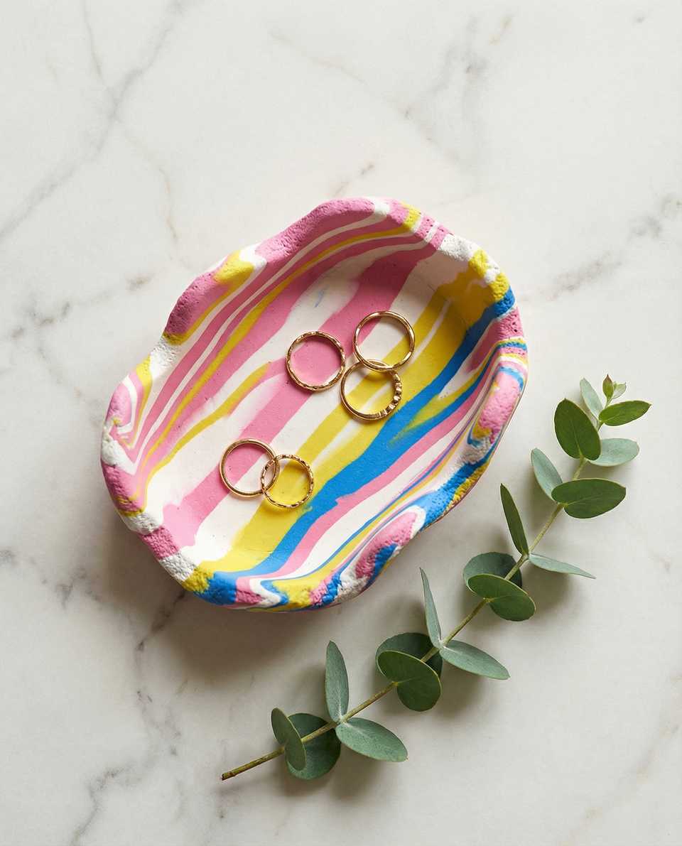
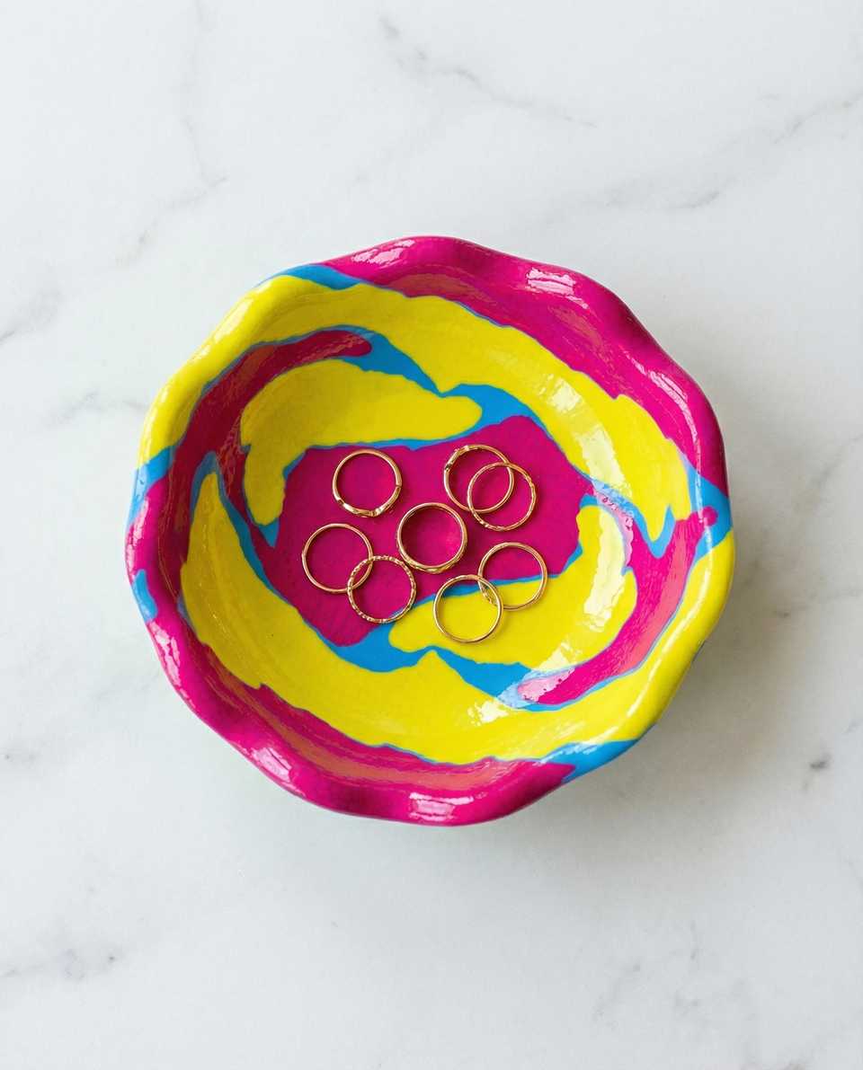
Use the marbling guide when you want the source colors to stay visible instead of blending into one uniform tone.
Other reads on this topic

How to Marble Polymer Clay: Beginner Tutorial (Step by Step)
Learn how to marble polymer clay with three colors, a roller, and a blade. A beginner tutorial with pulled, stacked, and tile-cut variations, plus the fix for muddy slabs.

How to Make Polymer Clay Mushrooms: Cap, Stem, and Spotting Tutorial
A beginner-friendly polymer clay mushroom tutorial: condition, shape a stable stem, dome the cap, press on white spots, support the overhang, and bake by package directions.

How to Reverse-Engineer a Polymer Clay Design from a Photo
You tried to copy a photo and ended up with a pile of failed test pieces because you guessed the build order. Study the front view first, diagnose the exact construction, and test your build theory on scrap clay before you touch your good colors.
Finished examples with related clay decisions
Each piece shows how a material, attachment, or surface choice changes the final form.