Three 2026 Paint Color Signals to Test in Polymer Clay
Chasing every 2026 trend color can leave you with blocks you do not use. Before you commit to a full batch, bake small swatch chips and test the finish. This guide gives you three 2026 color directions plus the swatch test that confirms a color before you scale it.

In brief
Key takeaways
- 1Benjamin Moore and Sherwin-Williams 2026 paint announcements point toward deep brown and warm khaki palettes worth testing for clay; Behr's 2026 pick Hidden Gem adds a smoky blue-green.
- 2Treat annual trend posts as dated snapshots. Re-check the brand announcements before reusing the same palette next year
- 3Bake small swatch tiles before committing to a full collection so finish and saturation stay consistent across pairs
If you want a 2026 palette plan anchored to real source material, start with official paint-color announcements instead of vague mood boards. This guide adapts three 2026 paint-color signals into polymer clay palette tests built around deeper browns, usable khaki neutrals, and smoky blue-greens.
Treat these as dated reference points tied to the current brand announcements, not as a permanent clay forecast. If you revisit this page later in 2026 or roll the ideas forward into 2027, re-check the paint releases first.
The 2026 Color Signals Worth Tracking
Benjamin Moore's Silhouette AF-655, Sherwin-Williams' Universal Khaki SW 6150, and Behr's Hidden Gem N430-6A point toward three useful 2026 directions for clay: a refined dark brown, a warm khaki neutral, and a smoky jade blue-green.
Silhouette gives you the dark anchor, Universal Khaki gives you the warm everyday neutral, and Hidden Gem gives you the cool accent that still feels grounded. Together they give you three practical directions to test before chasing a longer list of color ideas. Each direction below includes a clay starting mix; treat every ratio as a swatch-test starting point (the color mixing guide covers the baked-chip workflow).
Browse pieces with this feel
Open related pieces when you want a starting point for palette, silhouette, texture, or hardware.
Direction 1: Silhouette AF-655 for Refined Dark Browns
Use Silhouette when you want brown to feel polished, graphic, and slightly dramatic instead of rustic.
Benjamin Moore positions Silhouette AF-655 as a deep brown with burnt-umber depth and charcoal undertones. In polymer clay, that translates well to matte earrings, front-facing buttons, sculptural beads, frames, trays, and any project where a dark neutral needs more depth than flat black.
- Starting mix to swatch: Burnt umber with a small pinch of black, warmed with a speck of red if the chip bakes too cold; adjust from a baked test chip, not the raw color
- Best pairings: Bone, soft cream, muted plum, brushed gold, smoked brass
- Finish directions to test: Satin buff, soft matte, or lightly antiqued texture
- Useful forms to test: Rounded arches, oversized coat buttons, house-shaped dangles, low-relief art objects
Direction 2: Universal Khaki SW 6150 for Warm Neutrals
Khaki works as the quiet base under a bright cane slice. It keeps a collection looking intentional instead of scattered, so it is worth baking a khaki chip first and testing a bright slice against it before any louder color goes into a batch.
Sherwin-Williams presents Universal Khaki SW 6150 as a warm mid-tone neutral with a slight yellow undertone. For polymer clay, it works as a practical base color that keeps collections cohesive without turning flat or cold. It reads especially well on slab earrings, trinket dishes, decorative buttons, miniature vessels, and costume details on figurines.
- Starting mix to swatch: Roughly 3 parts white to 1 part ecru with a speck of yellow ochre and a smaller speck of burnt umber to pull it warm; bake the chip before judging
- Best pairings: Chalk white, camel, terracotta, cocoa, smoked olive
- Finish directions to test: Matte, softly buffed satin, or a water-based glaze already tried on a sample for higher-touch pieces
- Useful forms to test: Pebble studs, geometric slabs, sew-through buttons, trays, small vessels
Direction 3: Hidden Gem N430-6A for Smoky Blue-Green Accents
Hidden Gem is one of the cooler 2026 signals in this set, but it still feels grounded enough for quieter palettes.
Behr frames Hidden Gem N430-6A as a smoky jade between blue and green. That makes it useful for polymer clay makers who want color without going neon. It is especially strong in translucent layers, cane accents, marbled slabs, and character details like capes, hair streaks, armor panels, or props.
- Starting mix to swatch: Green with a touch of blue, knocked back with white and a speck of black until it reads smoky rather than minty; the complement speck (a hint of red) mutes it further if the chip bakes too bright
- Best pairings: Bone, charcoal, soft taupe, oxidized silver, muted navy
- Finish directions to test: Buffed satin, translucent layering, or subtle mica highlights
- Useful forms to test: Cabochons, patterned canes, statement pendants, art-toy accents, character accessories
How to Translate 2026 Paint Trends Into Clay Palettes
Build each palette with baked swatch chips first, then test finish and translucency before you commit to a full batch.
- Roll equal-thickness swatches with an acrylic roller so the color comparison stays useful when you compare the baked results.
- Test one finish at a time: raw matte, buffed satin, or a water-based glaze you have already tried on that clay line.
- Add translucent clay when you want depth rather than reaching for white every time. Premo Translucent is a practical starting point for these tests.
- Use color-shift materials sparingly and test tiny amounts first so the palette stays grounded while you tune the finish.
| 2026 signal | Clay translation | Strongest use case |
|---|---|---|
| Silhouette AF-655 | Chocolate-brown with charcoal depth | Statement earrings, coat buttons, framed relief work |
| Universal Khaki SW 6150 | Warm khaki, putty, and sand neutrals | Slab jewelry, sew-through buttons, trays, small vessels |
| Hidden Gem N430-6A | Smoky jade blue-green with muted depth | Faux-stone details, canes, marbling, character accents |
Where the 2026 Colors Fit Best
Do not use all three 2026 colors in one piece. Match each color to the form where it does the most work.
- Jewelry: Let Silhouette or Hidden Gem carry the shape, then keep the supporting neutral quiet.
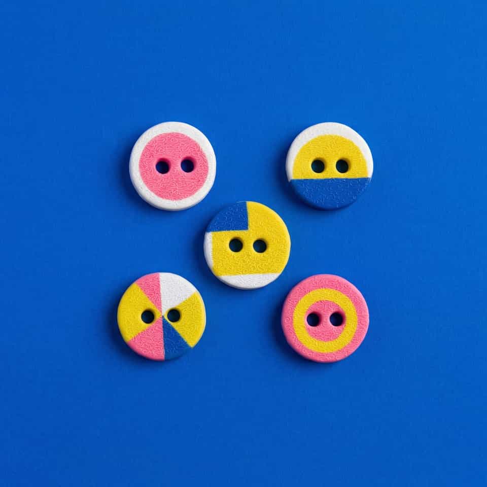
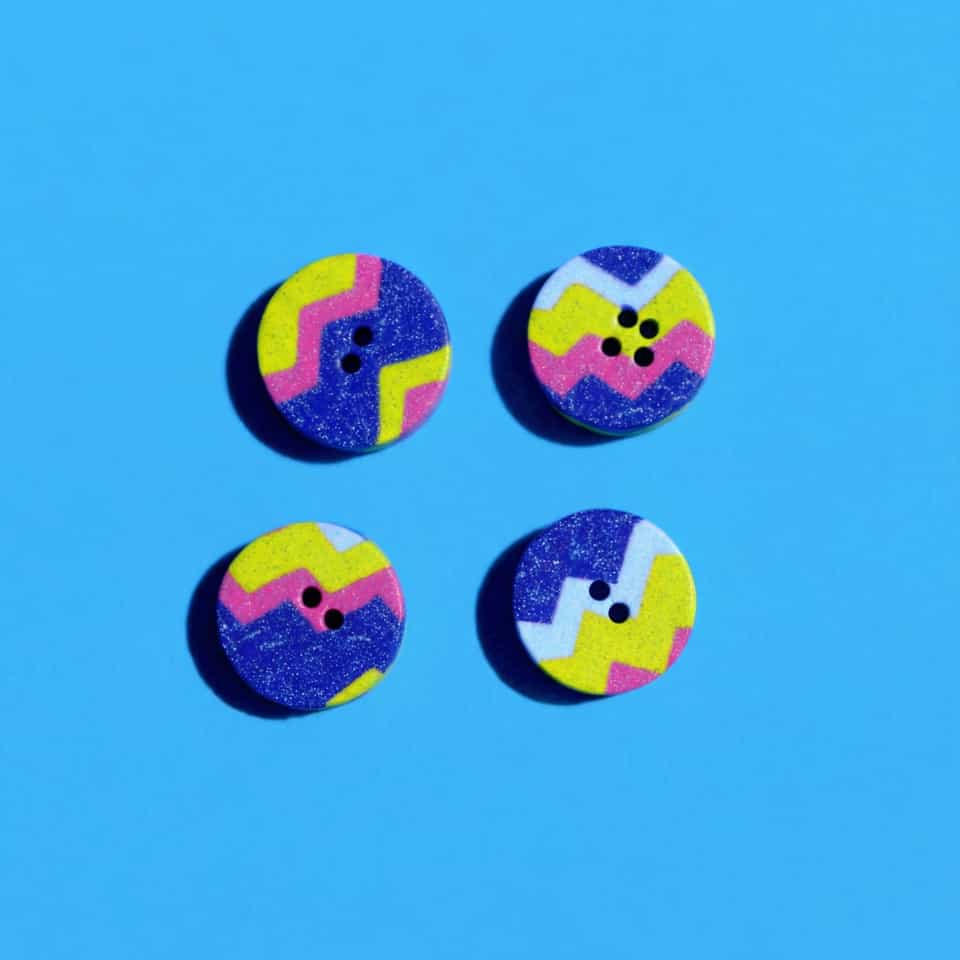
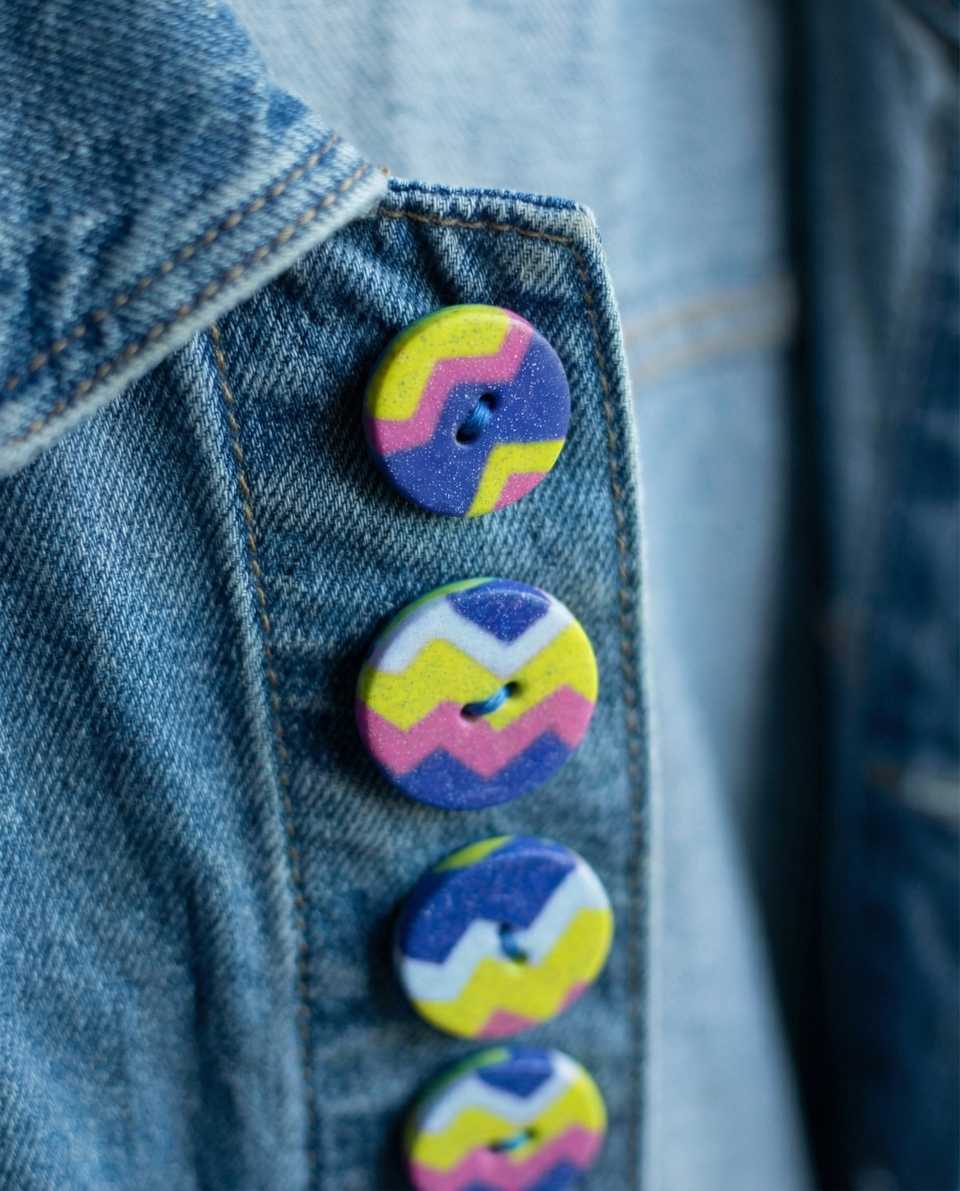
- Buttons and wearable objects: Universal Khaki and Silhouette can both read well on matte, garment-scale sew-through buttons.
- Art objects: Hidden Gem works beautifully as an accent against warm neutrals on trays, ornaments, and framed relief tiles.
- Character designs: Use Hidden Gem for props, armor panels, hair accents, or capes, then anchor the rest of the palette in khaki, cream, or cocoa.
For clay work, the better question is not "which color is trendy?" It is "what job does this color do in the piece?" A dark brown can replace black when black feels too harsh. A khaki neutral can make bright cane slices easier to wear. A smoky blue-green can give a miniature or pendant a current accent without turning the whole palette loud.
Other reads on this topic

Polymer Clay Creative Block and the Bestseller Trap
The block that stops sellers is usually not 'no ideas.' It is being trapped by the one design everyone buys, or staring at orders you no longer want to make. This guide names the seller-specific triggers and gives 8 resets that clear the worktable faster than another mood board.

Polymer Clay Color Mixing: Sage, Terracotta + Test Chips
Premo starting ratios, color theory basics, and troubleshooting notes you can verify with baked swatch chips before mixing a larger batch.
Finished examples with related clay decisions
Each piece shows how a material, attachment, or surface choice changes the final form.