In brief
Key takeaways
- 1Mute any color by adding a tiny speck of its complement (opposite on the color wheel)
- 2Use the sage and terracotta ratios in this page as Premo starting mixes, not fixed formulas
- 3Always bake a test chip before mixing large batches - colors can shift during baking
- 4Keep a color journal with recipes, brand, and baked sample chips for consistency
If straight-from-the-wrapper color keeps pulling your work off course, custom color mixing is one practical way to make a palette feel more deliberate.
Here's what you'll find: color theory basics adapted from Josef Albers' "Interaction of Color" principles, 8 starting ratios to test for earthy tones in Premo, troubleshooting notes for common mix problems, and a brand-comparison section you can use as a test-swatch prompt rather than a final ranking.
Understanding Color Theory Basics
Polymer clay color mixing uses three key principles: primaries can't be mixed from other colors, warm and cool undertones set mood, and complements mute brightness.
First, the fundamentals. Once you understand these, you can mix a much wider range of colors than the package lineup gives you.
The Color Wheel: Your Best Friend
Every color relationship starts with the color wheel. Here's what you need to know:
- Primary Colors: Red, Yellow, Blue - you can't mix these from other colors, so keep them in your clay stash
- Secondary Colors: Orange (Red + Yellow), Green (Yellow + Blue), Purple (Blue + Red)
- Tertiary Colors: Mix a primary with an adjacent secondary (like red-orange or blue-green)
Warm vs. Cool Tones
This is where most beginners go wrong. Every color has warm and cool variations:
- Warm colors lean toward yellow/orange undertones - think terracotta, mustard, warm beige
- Cool colors lean toward blue undertones - think sage (has blue in the green), dusty rose (has purple undertones)
The magic happens when you mix warm and cool versions thoughtfully. That's how you get those sophisticated, "muted" tones that look more refined.
The Secret: Adding the Complement
Want to "mute" or "dirty" a color? Add a tiny bit of its complementary color (the color opposite on the wheel):
- Red + Green = Muted red (like terracotta or brick)
- Yellow + Purple = Muted yellow (like mustard or ochre)
- Blue + Orange = Muted blue (like slate or steel)
This is why most of our recipes include a tiny "speck" of an unexpected color - it's doing the muting work.
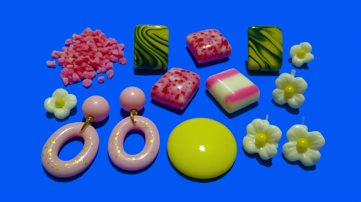
A lot of the current earthy look in polymer clay comes from mixing complementary colors in small amounts. Adding a tiny speck of green to red can push a mix toward terracotta. A touch of purple can mute yellow toward mustard. A bit of brown can pull green toward sage. These desaturated tones often read more deliberate than saturated package colors used straight.
See this technique in finished pieces
Browse lookbook entries that use this approach so you can compare shape, materials, and overall direction.
Maker reference
Maker reference only. Verify brand instructions, seller details, dimensions, and safety guidance for your own setup.
Affiliate note
Some links in this article are affiliate links. If you buy through them, we may earn a small commission at no extra cost to you. As an Amazon Associate I earn from qualifying purchases.
The Recipes: 8 Earthy Tone Starting Points
These eight Premo ratios are starting points for sage green, terracotta, sand beige, mustard, dusty rose, olive, taupe, and spiced pumpkin.
These mixes are written around Sculpey Premo, but clay line, pigment load, thickness, and cure can all shift the result. If you adapt them for Soufflé or Fimo, confirm the final color with baked swatch chips before you mix a production batch. We use "parts" so you can scale the recipes up or down.
| Color | Base | Recipe (Parts) | Mood / Use |
|---|---|---|---|
| Sage Green | White | 4 White + 1 Green + 1/8 Brown | Nature, minimalist |
| Warm Terracotta | Burnt Orange | 2 Burnt Orange + 1 White + 1/2 Gold | Boho, fall collections |
| Sand Beige | White | 3 White + 1 Ecru | Neutral base, minimalist |
| Muted Mustard | Cadmium Yellow | 2 Cad. Yellow + 1 White + 1/4 Raw Sienna | Warm accent, fall |
| Dusty Rose | White | 4 White + 1 Pomegranate + 1/2 Beige | Cottagecore, romantic |
| Deep Olive | Green | 2 Green + 1 Raw Sienna + 1/2 Black + 1/4 White | Moody, fall/winter |
| Warm Taupe | White | 3 White + 1 Ecru + 1/2 Raw Umber + 1/8 Purple | Universal neutral |
| Spiced Pumpkin | Orange | 2 Orange + 1 Raw Sienna + 1/2 Cad. Red + 1/4 White | Autumn, rich accent |
1. The Perfect Sage Green
This is a dusty, muted green that stays useful across a lot of earthy palettes. It's not too minty and not too forest-heavy.
- 4 Parts: Premo White
- 1 Part: Premo Green
- 1/8 Part: Premo Brown (just a tiny speck!)
Tip: Add more white if you want a paler eucalyptus-leaning version.
2. Warm Terracotta
A rich, earthy orange that reads close to fired pottery. Useful for boho designs and fall-leaning collections.
- 2 Parts: Premo Burnt Orange
- 1 Part: Premo White
- 1/2 Part: Premo Gold (adds a subtle shimmer in this version)
3. Modern Beige (Sand)
Better than plain white, warmer than grey. A useful neutral base for minimalist designs or as a foundation for stamped and textured pieces.
- 3 Parts: Premo White
- 1 Part: Premo Ecru
4. Muted Mustard
A sophisticated yellow that isn't neon. This warm tone pairs beautifully with sage and terracotta for cohesive collections.
- 2 Parts: Premo Cadmium Yellow
- 1 Part: Premo White
- 1/4 Part: Premo Raw Sienna
5. Dusty Rose
A soft, vintage pink that can sit well in cottagecore-leaning palettes without going sugary.
- 4 Parts: Premo White
- 1 Part: Premo Pomegranate (or any dark red)
- 1/2 Part: Premo Beige
6. Deep Olive Green
A moody green that works well in fall and winter palettes. It also pairs well with gold leaf accents.
- 2 Parts: Premo Green
- 1 Part: Premo Raw Sienna
- 1/2 Part: Premo Black
- 1/4 Part: Premo White
Tip: The Raw Sienna adds some of the warmth that keeps this olive mix from reading too cold.
7. Warm Taupe
A versatile neutral when you want something warmer than cool grey without pushing too yellow.
- 3 Parts: Premo White
- 1 Part: Premo Ecru
- 1/2 Part: Premo Raw Umber (or any dark brown)
- 1/8 Part: Premo Purple (this small amount can cool the mix slightly toward greige)
8. Spiced Pumpkin
Deeper than terracotta and less brown than rust. This autumn shade can work well in September-through-November palettes.
- 2 Parts: Premo Orange
- 1 Part: Premo Raw Sienna
- 1/2 Part: Premo Cadmium Red
- 1/4 Part: Premo White
Troubleshooting Common Color Mixing Problems
Most color mixing problems come from adding too much muting color, brand differences causing uneven blending, or unexpected color shift after baking without testing first.
Even experienced makers run into issues. Here's how to fix the most common problems:
Color shift after baking is normal for polymer clay and varies by brand, thickness, and pigment. Translucent clays often shift the most, sometimes becoming more amber or clear after curing. Some colors darken or lighten noticeably. The only reliable way to predict your final color is to bake a small test chip at the correct temperature before mixing a full batch. Keep a baked sample library so you can match colors more confidently over time.
Problem: Color is too bright/saturated
Solution: Add white to lighten, OR add a tiny speck of the complementary color to mute it. For example, if your green is too "Kermit," add a tiny bit of red or brown.
Problem: Color looks muddy or grey
Solution: You've added too much of the complementary/muting color. Unfortunately, you can't undo this - but you can shift the hue. Try adding more of the dominant color to bring back vibrancy, or lean into it and create a "stone" or "concrete" shade.
Problem: Colors from different brands won't blend smoothly
Solution: Different clay lines can feel stiffer or softer, so condition each one separately first, then blend gradually. If a line stays firm, test a small mix and adjust your conditioning routine before you scale up.
Problem: Mixed color looks different after baking
Solution: This is called "color shift" and some clays do this more than others (especially translucents). Always bake a small test chip before committing to a large batch. Some colors darken, some lighten - document which ones for your reference.
Problem: Can't recreate a color you mixed before
Solution: This is why we beg you to write down recipes! If you're trying to match an existing piece, condition a small ball of the original baked clay next to your new mix (baked clay can sit beside raw clay for comparison). Adjust until they match under natural light.
Brand Color Comparison: Premo vs. Soufflé vs. Fimo
Different clay lines can push the same recipe in different directions: Premo is the closest match to the ratios in this page, Soufflé often reads softer and more muted, and firmer Fimo lines may need fresh swatch adjustments.
Use this chart as a test-swatch prompt, not a universal ranking. Not all whites, blacks, and primaries behave the same once conditioned and baked.
| Color | Premo | Soufflé | Fimo Professional |
|---|---|---|---|
| White | Bright, clean white | Slightly warm/cream | Very bright, cool white |
| Black | True black, strong | Soft black, matte finish | Intense black |
| Primary Red | Cadmium Red (warm) | Cherry Pie (cool, berry) | True Red (neutral) |
| Primary Yellow | Cadmium Yellow (warm) | Canary (bright, cool) | True Yellow (neutral) |
| Primary Blue | Ultramarine (warm blue) | Bluestone (muted, grey) | Ultramarine (bright) |
| Mixing Behavior | Smooth, predictable | Colors stay muted | Firm, precise control |
Our recommendation: Start with the clay line you already use consistently. If you want the closest match to the recipes in this page, Premo is the direct starting point; Soufflé and firmer Fimo lines usually need small ratio tweaks and fresh baked test chips.
How to Store Your Mixes
Wrap custom-mixed clay tightly, label the recipe, and test an older mix before you rely on it for an important batch.
Once you've mixed a custom color, wrap it tightly in plastic wrap (cling film) or keep it in an airtight container. Label it with the exact recipe so you can compare it later.
Properly wrapped polymer clay often stays workable for a long time when stored in a cool spot away from direct sun and heat, but firmness can still change with age, brand, and storage conditions. Knead a small test piece before you rely on an older mix for a larger job.
Pro tip: Keep a "color journal" or spreadsheet with:
- Recipe name and date created
- Exact parts of each color used
- Brand used
- Baked sample chip taped to the page
- Notes on any color shift after baking
Keep reading
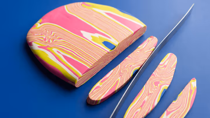
Mokume Gane in Polymer Clay
Learn a practical layered-slice method for wood-grain and stone-like patterns in polymer clay, with safer guidance on slice control and support.

How to Reverse Engineer Any Clay Design You See Online
Learn a structured way to study construction, layers, color choices, and finishing clues from a reference photo without copying it line for line.
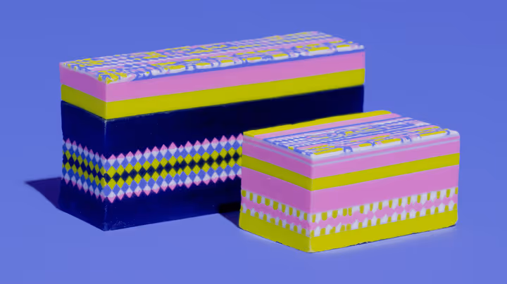
Nerikomi for Polymer Clay: The Complete Guide to Japanese Layered Patterns
Master the ancient Japanese ceramic technique of nerikomi using polymer clay. Learn to create stunning layered patterns - spirals, checkerboards, and bullseyes - that run all the way through your jewelry pieces.